


Table of Contents
KPI Dashboards: Your Roadmap to Peak Performance
In today’s fast-paced business world, it is essential to have a clear understanding of your organisation’s performance at all times. Key Performance Indicators (KPIs) are essential to monitor your business’s progress and ensure that it stays on track.
However, it can be challenging to interpret raw data and gain insights from it. This is where KPI dashboards come in. KPI dashboards provide a visual representation of your organisation’s KPIs, making it easier to track and analyse data, identify trends, and make data-driven decisions.
In this blog, we will discuss the importance of tracking KPIs, the importance of KPI dashboards, what to consider when creating a KPI dashboard, and some best practices for visualising your key performance indicators.
Whether you are a small business owner or a corporate executive, this guide will provide you with the knowledge and tools needed to build an effective KPI dashboard that will drive your business forward.
What is KPI?
Key Performance Indicators (KPIs) are essential metrics that help organisations measure their progress towards specific goals and objectives. KPI dashboards are powerful tools that enable businesses to visualise and track their KPIs in real time.
These dashboards display relevant KPIs on a single screen, making it easy for decision-makers to monitor and analyse their business performance at a glance. In this blog, we will discuss what KPI dashboards are and how to create them using various platforms.
What are KPI Dashboards?
A KPI dashboard displays key performance indicators for specific strategic objectives. The dashboard allows users to monitor these KPIs and track progress toward their goals in real time. The dashboard can be customised to display KPIs in various formats, including tables, graphs, and charts. The dashboard can also send alerts and notifications when specific KPIs reach critical thresholds.
What is the Importance of KPI Dashboards?
KPI dashboards are crucial in today’s business world as they clearly, concisely, and visually represent an organisation’s key performance indicators.
Here are some of the key benefits of using KPI dashboards:
- Better decision-making: KPI dashboards enable decision-makers to quickly identify trends, patterns, and insights in real time, allowing them to make informed decisions.
- Increased transparency: KPI dashboards give stakeholders a transparent view of an organisation’s performance, allowing them to see how the business is progressing towards its goals and objectives.
- Improved performance: By tracking and monitoring KPIs, organisations can identify areas that need improvement and take corrective actions to enhance their overall performance.
- Increased accountability: KPI dashboards make tracking progress and measuring performance easy, promoting accountability across an organisation.
- Time-saving: KPI dashboards automate data collection and analysis, reducing the time and effort needed to gather and interpret data manually.
Things to consider while creating a KPI Dashboard
When creating a KPI dashboard, several important factors must be considered to ensure that it is effective and useful. Here are some key considerations:
Identify the Right KPIs
The first step is to identify the most relevant KPIs to your organisation’s goals and objectives. It is important to select KPIs that are measurable, specific, and aligned with your organisation’s strategy.
Determine the Target Audience
Consider who will use the dashboard and what information they need to see. This will help you determine the layout, design, and level of detail needed.
Choose the Right Visualizations
Different KPIs require different types of visualisations to communicate their meaning effectively. Consider the best way to represent each KPI, such as a line chart, bar chart, or gauge.
Establish Benchmarks
It is important to establish benchmarks and goals for each KPI to track progress and identify areas that need improvement.
Keep it Simple
A cluttered or complex dashboard can be overwhelming and difficult to understand. Keep the design simple, use clear language, and only include essential information.
Ensure Accuracy
Ensure that the data used in the dashboard is accurate and up-to-date. This will ensure that decisions are based on reliable information.
Use clear and concise language
Use clear and concise language to label KPIs and visualisations. Avoid using technical terms that may not be familiar to everyone who will use the dashboard.
Use Visualizations Effectively
Use visualisations such as charts and graphs to convey information quickly and efficiently. Choose visualisations that are appropriate for the data and easy to understand.
Highlight key information
Use colour and formatting to draw attention to important information, such as trends, goals, and targets.
Ensure Accessibility
Ensure that the dashboard is accessible to all users. Use a clear and legible font size and style, provide alt-text for images, and make sure that the dashboard is easy to navigate.
Allow for Customization
Allow users to customise the dashboard to their needs, such as by adding or removing KPIs or adjusting the layout.
Test and Iterate
Test the dashboard with users to identify any issues or areas for improvement. Iterate and refine the dashboard to ensure that it meets users’ needs and effectively communicates the KPIs.
KPI Dashboards: Examples & Benefits
There are several KPI dashboard examples available on the internet. Some of the most popular platforms for creating KPI dashboards include Qlik, Microsoft Power BI, Data Pine, Sisense, Klipfolio, Simple KPI, Yellowfin, Copypress, and Zoho Analytics. Each platform has its unique features, but they all share the same goal: to help businesses visualise and monitor their KPIs effectively.
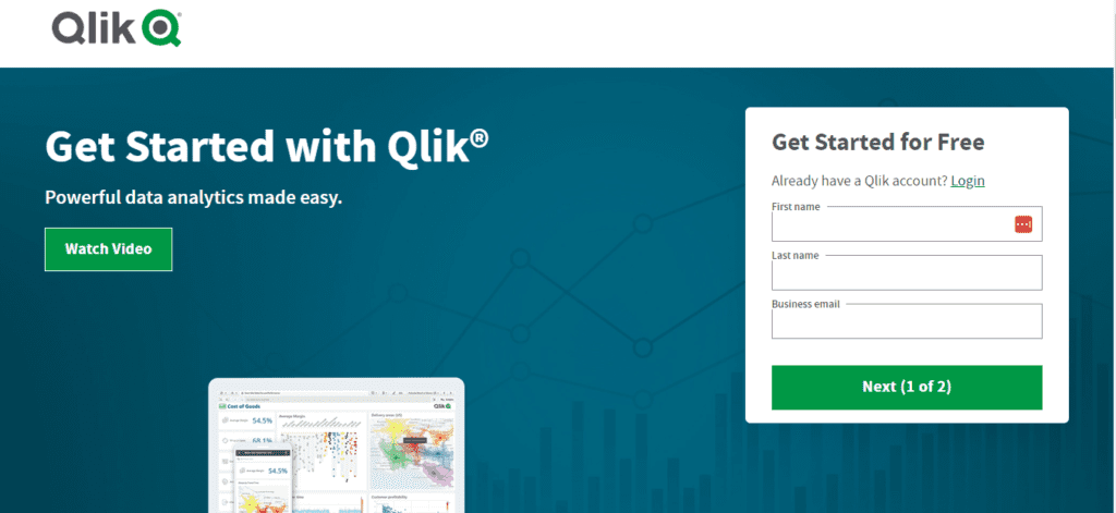
Qlik
Qlik provides a wide range of KPI dashboard examples, including financial dashboards, sales dashboards, and operational dashboards. These dashboards use interactive visualisations to display KPIs in real-time, allowing decision-makers to make data-driven decisions quickly.
Microsoft Power BI
Microsoft Power BI offers a range of KPI dashboard templates that businesses can customise to suit their specific needs. The platform allows users to import data from various sources and use drag-and-drop tools to create their own dashboards.
Data Pine
Data Pine offers a range of pre-built KPI dashboards that businesses can use to monitor various KPIs, including revenue, customer retention, and marketing performance. The platform allows users to customise their dashboards with a drag-and-drop interface and share them with team members.
Sisense
Sisense provides KPI dashboard examples that display business performance metrics in real-time. The platform allows users to create interactive dashboards with drill-down capabilities and automated alerts.
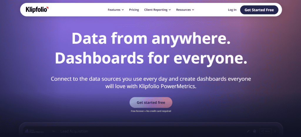
Klipfolio
Klipfolio offers a range of KPI dashboard examples, including executive, marketing, and sales dashboards. The platform allows users to customise their dashboards with widgets and charts and share them with team members.
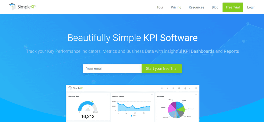
Simple KPI
Simple KPI provides a comprehensive guide to creating KPI dashboards. The platform offers pre-built templates for various industries, including healthcare, retail, and finance. Users can customise their dashboards with various widgets, including tables, graphs, and charts.
Yellowfin
Yellowfin offers KPI dashboard examples that use data visualisations to display key metrics. The platform allows users to create custom dashboards with alerts and notifications when KPIs reach a critical threshold.
Copypress
Copypress provides KPI dashboard examples that help businesses measure the effectiveness of their marketing campaigns. The platform allows users to monitor metrics such as website traffic, social media engagement, and conversion rates.

Zoho Analytics
Zoho Analytics offers KPI dashboard templates for various industries, including e-commerce, healthcare, and education. The platform allows users to create custom dashboards with drag-and-drop tools and share them with team members.
Conclusion
KPI dashboards are powerful tools that enable businesses to monitor their performance in real-time. These dashboards display relevant KPIs on a single screen, making it easy for decision-makers to track progress towards their goals. There are several KPI dashboard examples available on the internet, and each platform offers its unique features.
Businesses can choose a platform that suits their specific needs and customise their KPI dashboard to display the metrics that matter most to them. By using KPI dashboards, businesses can make data-driven decisions, identify areas for improvement, and optimise their performance to achieve their strategic objectives.